Easy and Fast Website Accessibility Fixes
Your website can be way more accessible with only few small changes.
1. Relative units instead of pixels
Using relative units such as rems or ems instead of pixels allow text and other elements to scale properly when users zoom in, increase browser text size, or use accessibility settings on their device. This makes websites easier to read without breaking the layout.
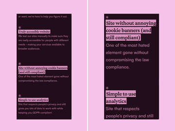
Left screen - Font size set in pixels keeps the text size unchanged. On the right screen you can see how the website makes the text bigger when relative units are being used instead.
Who relative units help
- People with low vision
- Older adults with worse eyesight
Roughly 20–30% of people benefit from larger, scalable text.
2. Adding “Skip to main content” link
A “Skip to main content” link is a hidden link at the top of the page that becomes visible when someone uses their keyboard to navigate through the page. It allows users to jump quickly past navigation menus directly to the main content.
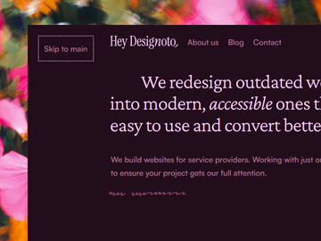
Code example:
<a href="#main-content" class="skip-link">
  Skip to main content
</a>
How “Skip to main content” link helps
Without this link, keyboard and screen reader users need to tab through dozens of navigation links on every page before reaching the actual content.
A skip link saves their time and makes navigation much less frustrating.
Who “Skip to main content” link helps
- Blind people using screen readers
- People navigating with only a keyboard
- People with motor disabilities who cannot use a mouse
20–30% of users benefit from improved keyboard navigation.
3. Visible keyboard focus
Keyboard focus is the visual highlight shown when someone tabs through buttons, links, or form fields on a page by using their keyboard. Many Web Developers accidentally remove this outline.
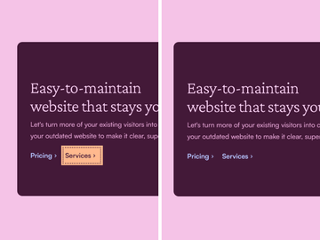
How visible keyboard focus helps
Visible focus indicators help people understand where they currently are on the page while navigating without a mouse. Without it, keyboard users can't navigate throught the site.
How to add a clear focus style in CSS:
  * :focus-visible {
  outline: 0.2rem solid blue !important;
  outline-offset: 0.15rem !important;
  box-shadow: 0 0 0 0.5rem yellow !important;
  text-decoration: none !important;
}
This takes only a few lines of code and immediately improves usability.
Who visible keyboard focus helps
- People with low vision
- Keyboard-only users
- People with motor impairments who don't use mouse
- Power users who prefer keyboard navigation
4. Moving content from PDF documents into HTML pages
Instead of storing important information as downloadable PDF files, it can be published directly as a normal web page whenever possible.
For example:
- Menus, catalogs
- Pricing lists
- Reports
- Privacy Policies
- Guides
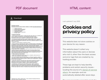
Why this matters
PDFs are often difficult to use on mobile devices because they do not automatically adapt to smaller screens. Users may need to:
- Zoom in
- Scroll horizontally
- Pinch and drag around the page to read the text
HTML pages are responsive, meaning the content automatically adjusts to fit phones, tablets, laptops, and larger screens. And as a bonus, HTML pages are also better for SEO because it helps search engines understand and rank the content more accurately.
Use PDFs mainly when you want to give people a printable document.
Who this helps
- Screen reader users
- People visiting your site on mobile
- Everyone who doesn’t want to struggle with zooming and scrolling
Want to improve your website’s accessibility?
I’m here to help. Web accessibility is part of good design — it will make your website easier to use, understand, and more comfortable for everyone, not only people with disabilities.
Web Accessibility servicesConclusion
Small accessibility improvements can make a huge difference for real people. Many of them won’t take more than an hour to implement.
You don’t need a complete redesign or a huge budget. Visible keyboard focus, scalable text, or skip links can immediately make your website easier to use for many, many people — depending on the size of your audience.